I recently wanted to make a header with tabs for my app’s pages that have a Pivot. Something like Office Mobile, but without the drop-down menus. Here’s the result I got in my upcoming app. I decided to post a tutorial and provide a sample app.
Notice the fast fade-in of the background color of the tab, this is important and is where you’ll be able to add your own flavor to the style after you’ve completed this tutorial. Ok, let’s get started!
Step One: Create the base elements
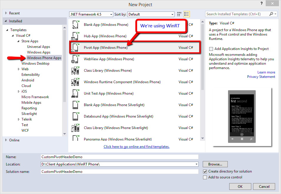
The two main components are a Pivot control and a ListView control. The Pivot has been stripped of it’s title template and pivot header templates. To get started, let’s do a File > New Pivot App (WinRT, not Silverlight) so that we’ll have some sample data and a pre-existing Pivot.
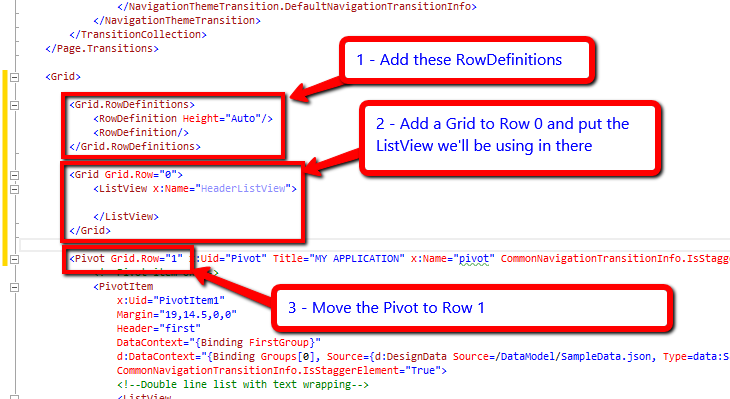
After the project template finishes, open PivotPage.XAML and add RequestedTheme=”Light” to the page’s properties. Next, find the root grid of the page. Add a couple RowDefinitions, with the first row’s height set to auto. Add a Grid containing a ListView to Row 0 and put the Pivot into Row 1.
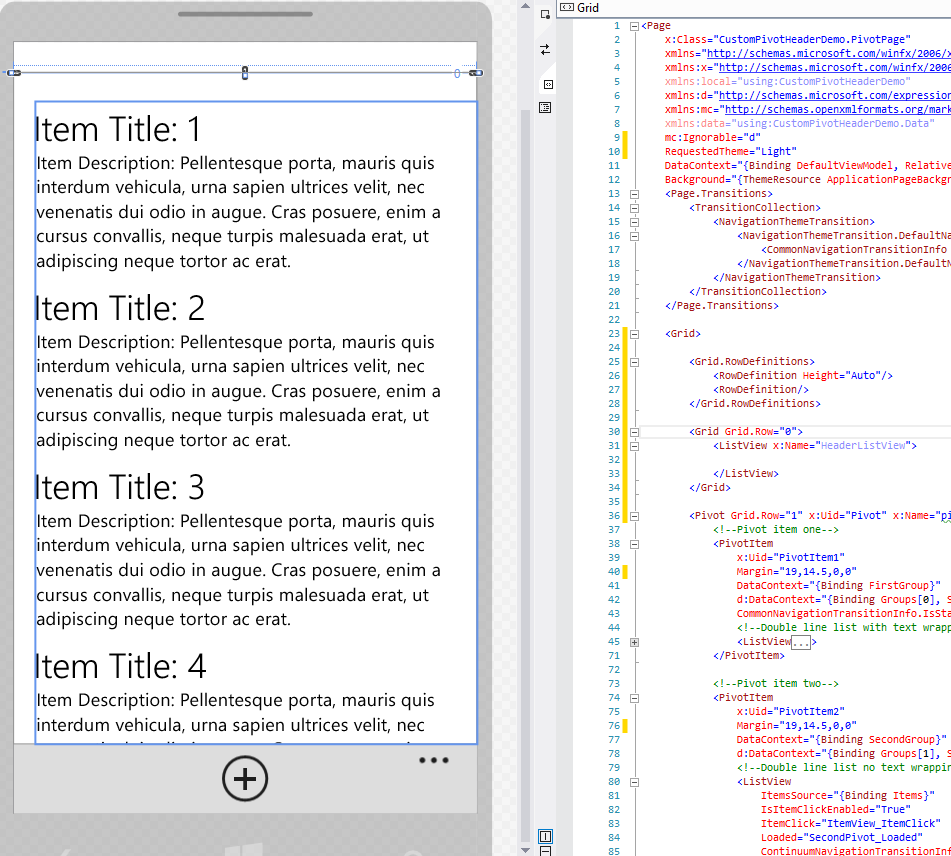
Now, let’s clean up the pivot. Delete the Pivot’s Title and both the PivotItem’s Header properties. You should be left with only the pivot item’s contents, this is what your page should look like at this point.
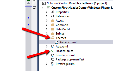
Step Two: Create a Control for the Tabs
My demo uses text, however there are other approaches that can use an icon or other element in the tab. Since not all XAML elements have a “Foreground” property that can automatically inherit from the parent ListView’s foreground, we’ll use a container control to hold the TextBlock. Make this by right clicking on your project and select Add > New Item. Then find Templated Control and give it the name HeaderTab.cs.

A template control has a backing style where the UI is defined while the control’s logic is in the file named after it. Visual Studio will add a folder named Themes and a ResourceDictionary Generic.xaml.
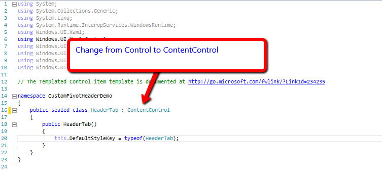
First, Open HeaderTab.cs and change the base class from Control to ContentControl. This will allow you to use the control as a ContentControl, which is what the ListViewItem’s template uses.
Next, open Generic.xaml, ignore the errors for now, they will go away when you do a Build at the end of this step. First, replace the Border control in the style with a TextBlock. Now, use TemplateBindings for the Text and Margin properties (see screenshot). This is how we pass the properties values of the ListView ItemContainerStyle to our custom control when the property types to match. The Margin property is a perfect example, we use the padding of the container style for the margin of the TextBlock, this will make more sense towards the end of the tutorial. Okay, now it’s time to do a Build (F6) so that your style’s TargetType will resolve.
This is what your Style should look like:

Step Three: Create a horizontal ItemsPanel
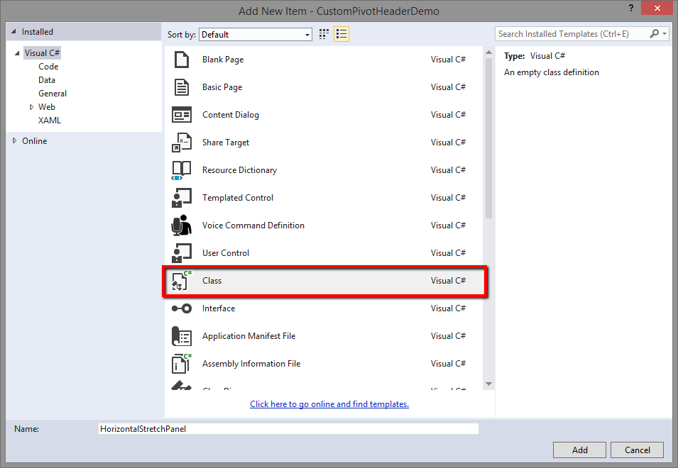
In order to tell the ListView to render the items horizontally, we need an ItemsPanel, however since we want the content of the tab to be in the center but also stretch to fill the available space, we can’t use a simple StackPanel. So, let’s make our own. Right click on your project and select Add > New > Class and name it HorizontalStretchPanel.
Explaining the process of calculating the available space and arranging the items is outside the scope of this article, but in a nutshell, we take the full width and divide it by the number of items then arrange to get the most space for each item. Here’s the code to copy/paste:
public class HorizontalStretchPanel : Panel
{
protected override Size ArrangeOverride(Size finalSize)
{
var rect = new Rect(0, 0, finalSize.Width, finalSize.Height);
var width = finalSize.Width / Children.Count;

foreach(var tab in Children)
{
rect.Width = width;
rect.Height = tab.DesiredSize.Height > finalSize.Height ? tab.DesiredSize.Height : finalSize.Height;
tab.Arrange(rect);
rect.X = width + rect.X;
}

return finalSize;
}

protected override Size MeasureOverride(Size availableSize)
{
if(Children.Count == 0)
return base.MeasureOverride(availableSize);

var finalSize = new Size { Width = availableSize.Width };
availableSize.Width = availableSize.Width / Children.Count;

foreach(var tab in Children)
{
tab.Measure(availableSize);
var desiredSize = tab.DesiredSize;
finalSize.Height = desiredSize.Height > finalSize.Height ? desiredSize.Height : finalSize.Height;
}

if(double.IsPositiveInfinity(finalSize.Height) || double.IsPositiveInfinity(finalSize.Width))
return Size.Empty;

return finalSize;
}
}
Step Four: Create a ListView Configuration and ItemContainerStyle
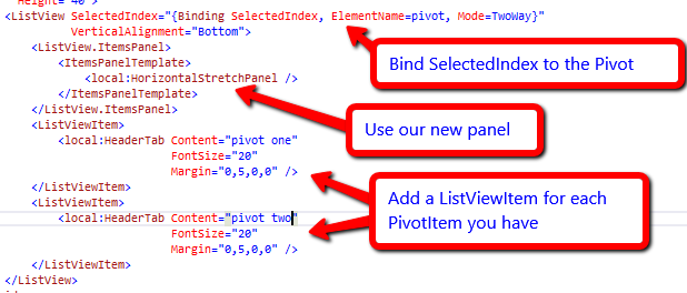
Now it’s time to go back to the ListView we added to the top of PivotPage.xaml . Before working on the ListView, Give the parent Grid a height of 50 and a good background that will contrast with white, I went with Blue. Now, onto the ListView. Let’s set the ListView.ItemsPanel to use our new HorizontalStretchPanel. Next, add some ListViewItems containing your new HeaderTab control. You’ll want one ListViewItem for each PivotItem you have. While you’re there, set the FontSize of your HeaderTab to 20.
Now, bind the SelectedIndex of the ListView to the SelectedIndex of the Pivot using an ElementName binding and set VerticalAlignment to bottom.
Here’s what it should look like thus far
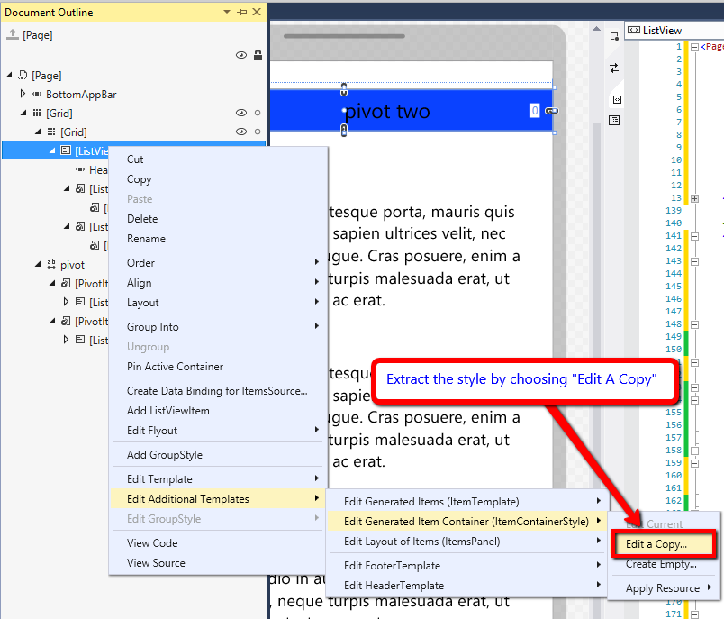
Now, it’s time to add some style and animation to the ListViewItemContainer. To begin, extract the ListView’s default ItemContainerStyle, this screenshot shows how:
Give a name, I chose HeaderListViewItemContainerStyle, once you click Ok, the ListView will get a StaticResource reference to the style in the page’s Resources. Scroll up to the top of the page and expand the style. Yeah, it’s pretty long. the part I want you to get to is the Template property. Within here you’ll see some animations, but go past them until you see the ContentControl. This is what shows your HeaderTab control, I like to give my template parts names with strong prefixes, you don’t have to, but it’s easier for identification when it comes to animation.
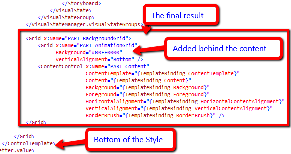
Now, let’s edit that template to add an extra Grid so we can act on it to get some cool fading animation when the user changes tabs. What we’re going to do is put the new Grid behind the ContentControl so that we don’t block the Text. To make this easier, here is what the XAML looks like after renaming the parts and adding the Grid.
Lastly, I went with White for the Style’s foreground property, this gets inherited by the TextBlock in your HeaderTab control. It will contrast well against the Blue background of the page header Grid.
Step Five: Animating the Container’s Parts
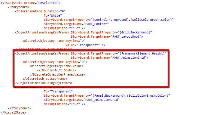
This is something that you’ll want to play with and where Blend can help you get the exact results you’re looking for. What we’re going to do is add some keyframes to the existing States: Unselected, Selected and SelectedFocused. Here’s where the string naming of the template parts comes in handy. First, in the Unselected state we want to style it they way we want it to look when the tab is not in focus. In this state I want my new Grid to have zero height. Here’s what that looks like:
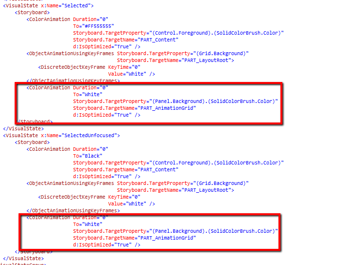
Now let’s go to the Selected and SelectedFocused states (they’re the same in my scenario). In this state I want the new Grid to be the full height of the tab and more importantly to have a white background.
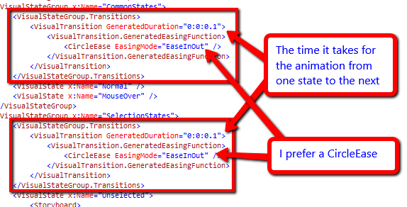
Lastly, the sugar that adds the magic… the transition animation. The cool thing about states is that you don’t have to write long storyboards, just set a Default Transition for a particular state. You can add these right to the VisualStageGroups directly (don’t forget to add some Easing). Here’s what it looks like
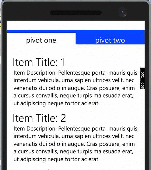
Almost done! Go through the Pivot and PivotItems and delete all the x:UID properties, these will change your UI at runtime because of localization, best to get them out of the way now. Whew! now it’s time to fire up the emulator and take it for a spin. This is what you should be seeing, if not, download the sample app from here and see what went wrong.
Happy coding!
hot damn that’s a good looking pivot. well done and thanks for this post.